Imputation panel comparison (HRC vs TOPMed)
Four CEPH samples (NA06990, NA07023, NA07057, NA10861) genotyped multiple times on the same array (Illumina GSAMD-24v1-0_20011747) by QIMRB were imputed to both HRCr1.1 and TOPMed reference panels. Comparing the PGS from the two different imputation, we find most traits highly consistent except a few.
Investigation on the two sets of data suggest the main difference in PGS are caused by the different SNP coverage. Hereby we developed a new method to transit the SNP weights to existing SNPs from missing SNPs when using the high density of SBayesRC predictors.
Related pages: PGS:QS · Missing SNPs and PGS-impute
1 summary difference
Here is a plot of average PGS comparing between the two imputation panel.
mean.prs.summary = melted.control.prs%>%
  group_by(Study_ID, variable, Impute_Panel) %>%
  summarise(
    mean.prs = mean(value)
  )%>%
  pivot_wider(
    names_from = Impute_Panel,
    values_from = mean.prs
  )

mean.prs.summary$difference = abs(mean.prs.summary$TopMedr3 - mean.prs.summary$HRCr1.1)
cross.sample.mean = mean.prs.summary %>%
group_by(variable) %>%
summarise(mean_difference = mean(difference)) %>%
arrange(mean_difference)
hist(cross.sample.mean$mean_difference, breaks = 50)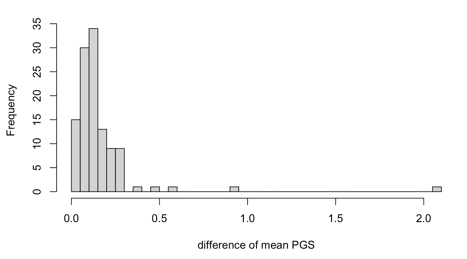
ggplot(data = mean.prs.summary, aes(x = HRCr1.1, y = TopMedr3, color =  Study_ID)) + geom_point()+
  geom_abline(intercept = 0, slope = 1) +
  geom_text_repel(data = mean.prs.summary %>% filter(difference > 0.5 ) ,
                    aes(label = variable), vjust = -1, color = "black", size = 1.5)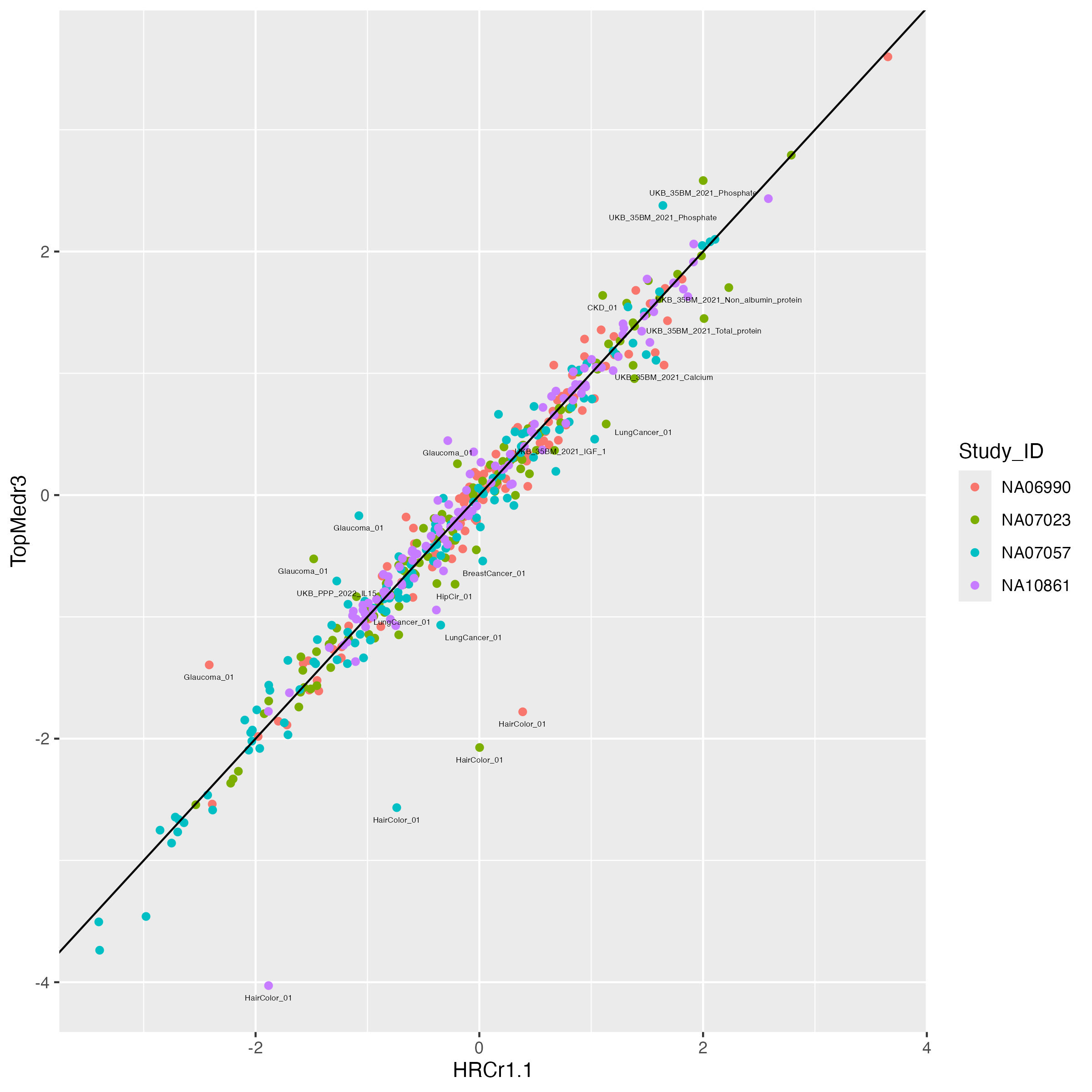
2 PGS Variation from imputation panels
2.1 set up function to plot
## define function
panel_plot = function(example.traits, facet.col, legend.pos,
                      melted.control.prs, data.vert, melted.prs ){

  ## we already have the data melted.prs, data.vert and melted.control.prs which includes all the traits.
  ## this function make plots with subsets of traits.

## select traits in data and  simplify to only HRC imputed for control samples
example.melted.prs = melted.prs[which(melted.prs$variable %in% example.traits ),]
example.data.vert = data.vert[which(data.vert$variable %in% example.traits),]
example.melted.control.prs = melted.control.prs[which(melted.control.prs$variable %in% example.traits ),]

# set order
order.matching.table = unique(example.melted.prs [,c("variable", "Trait")])
trait.order.for.plot = order.matching.table[match(example.traits, order.matching.table$variable), "Trait"]


## make them in factor
example.melted.prs$Trait = factor(example.melted.prs$Trait, levels = trait.order.for.plot)
example.data.vert$Trait = factor(example.data.vert$Trait, levels =trait.order.for.plot)
example.melted.control.prs$Trait = factor(example.melted.control.prs$Trait, levels = trait.order.for.plot)

example.melted.control.prs$imputation_panel = factor(example.melted.control.prs$imputation_panel, levels = rev(panel.order) )

xlimleft = round(min(c(-3, min(example.melted.control.prs$value)  ) ) - 0.05 , 1)
xlimright= round(max(c(3, max(example.melted.control.prs$value)  ) ) + 0.05 ,1)

## make plot
example.g.hist = ggplot() +
  geom_histogram(data =example.melted.prs , aes(x = value ), bins = 150, fill = "light grey", color = "light grey") +
  facet_wrap(~Trait,  ncol= facet.col ) +
#  geom_vline(data = example.data.vert, mapping = aes(xintercept = NA10861), color = "black") +
  geom_segment(data = example.data.vert, aes(x =NA10861, xend = NA10861, y= 0, yend = 1100 ) ) +
    geom_point(data = example.melted.control.prs, aes(x = value, y =y.position, color = Study_ID, shape = imputation_panel, alpha = imputation_panel), size = 1) +
  xlab("PGS in SD unit") +
  ylab("") + xlim(xlimleft, xlimright) +
    theme_classic(base_size = 14) +
theme(
   panel.grid.major = element_blank(), # Remove major grid lines
    panel.grid.minor = element_blank(), # Remove minor grid lines
    plot.title = element_text(hjust = 0.5),
    axis.title = element_text(),
    axis.text = element_text(size = 12),
    legend.position = legend.pos ,
    legend.text = element_text(size = 12),      # Legend item labels
    legend.title = element_text(size = 14)  ,
    strip.background = element_blank(),
#    strip.text = element_text(margin = margin(b = 20)),  # Add space below facet title
plot.margin = margin(0.1, 0.1, 0.1, 0.1)
   )+
  scale_alpha_manual(name = "Imputation Panel", values = c(0.4,1) ) +
  scale_shape_manual(name = "Imputation Panel", values = c(3,2) ) +
  scale_color_manual(
    name = "CEPH Individuals",
    values = c( color4)) +
  scale_y_continuous(labels = NULL, breaks = NULL, expand = expansion(mult = c(0, 0.15)))  # Remove both labels and ticks

return(example.g.hist)

}
2.2 figA. plot four good examples
example.traits = c("Height_03", "BMI_02", "Migraine_01", "IBD_02",
                   "Glaucoma_01", "HairColor_01", "LungCancer_01", "UKB_FA_2022_met.d.DHA_pct")


example.impu.hist1 = panel_plot(example.traits = example.traits[1:4],  facet.col = 4 , legend.pos = "none",  melted.control.prs = melted.control.prs, data.vert = data.vert, melted.prs =melted.prs )


info.text.a = data.frame(
 variable = example.traits[1:4],
 Trait = predictor.list[match(example.traits[1:4], predictor.list$Predictor),"Label"],
 variance = format(round(predictor.list[match(example.traits[1:4], predictor.list$Predictor),"total.variance"],3 ), nsmall=3) ,
 HRCr1.1 = paste0( round(100 * predictor.list[match(example.traits[1:4], predictor.list$Predictor),"QIMR_HRC"], 1 ) ,  "%"),
 TopMedr3 = paste0( round(100 * predictor.list[match(example.traits[1:4], predictor.list$Predictor),"QIMR_TopMed"], 1 ) ,  "%"),
 x = -0.5,
 y = Inf
)

info.text.a$variable = factor(info.text.a$variable , levels = info.text.a$variable )

info.text.a$Trait = factor(info.text.a$Trait , levels = info.text.a$Trait )

info.text.a$labels = paste0("V=", info.text.a$variance ,"; +:", info.text.a$HRCr1.1, "; \u25B3",":" , info.text.a$TopMedr3)

labeled.example.impu.hist1 = example.impu.hist1 +
  geom_text(
    data = info.text.a,
    aes(x = median(x), y = y, label = (labels) ),
    inherit.aes = FALSE,
    vjust =1,        # Push down from top
    hjust = 0.5,
    size = 4,
    family = "Arial Unicode MS"
  )

labeled.example.impu.hist1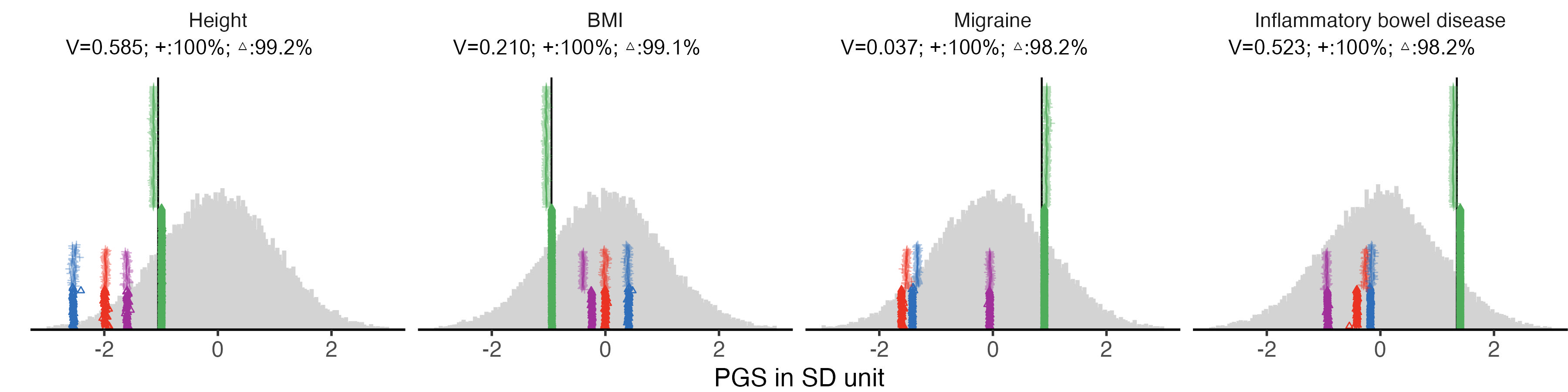
2.3 figB. four examples with large difference
example.impu.hist2 = panel_plot(example.traits = example.traits[5:8],  facet.col = 4 , legend.pos = "bottom",
                            melted.control.prs = melted.control.prs, data.vert = data.vert, melted.prs =melted.prs )

info.text.b = data.frame(
 variable = example.traits[5:8],
 Trait = predictor.list[match(example.traits[5:8], predictor.list$Predictor),"Label"],
 variance = format(round(predictor.list[match(example.traits[5:8], predictor.list$Predictor),"total.variance"],3 ), nsmall=3) ,
 HRCr1.1 = paste0( round(100 * predictor.list[match(example.traits[5:8], predictor.list$Predictor),"QIMR_HRC"], 1 ) ,  "%"),
 TopMedr3 = paste0( round(100 * predictor.list[match(example.traits[5:8], predictor.list$Predictor),"QIMR_TopMed"], 1 ) ,  "%"),
 x = -0.5,
 y = Inf
)

info.text.b$variable = factor(info.text.b$variable , levels = info.text.b$variable )
info.text.b$Trait = factor(info.text.b$Trait , levels = info.text.b$Trait )

info.text.b$labels = paste0("V=", info.text.b$variance ,"; +:", info.text.b$HRCr1.1, "; \u25B3",":" , info.text.b$TopMedr3)

labeled.example.impu.hist2 = example.impu.hist2 +
  geom_text(
    data = info.text.b,
    aes(x = median(x), y = y, label = (labels) ),
    inherit.aes = FALSE,
    vjust =1,        # Push down from top
    hjust = 0.5,
    size = 4,
    family = "Arial Unicode MS"
  )

labeled.example.impu.hist2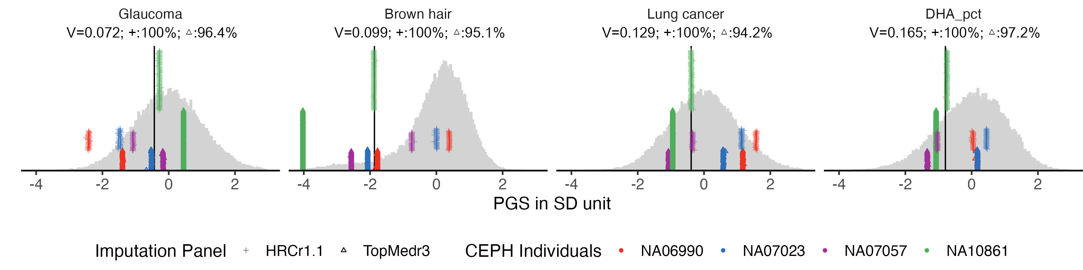
3 PGS variation of all traits (SupFig3 )
We used the same plot function to display all the 115 traits in 5 groups.
3.1 binary traits
example.g.hist = panel_plot(example.traits = traits_binary, facet.col = 5, legend.pos = "bottom" ,
                              melted.control.prs = melted.control.prs, data.vert = data.vert, melted.prs =melted.prs)
example.g.hist

fig.heit = ceiling(length(traits_binary) / 5 ) *2
#ggsave(example.g.hist, filename = "Figures/Fig_PGS_benchmarking_example_HRC_vs_TOPmed_binary.jpeg", width = 12, height = fig.heit)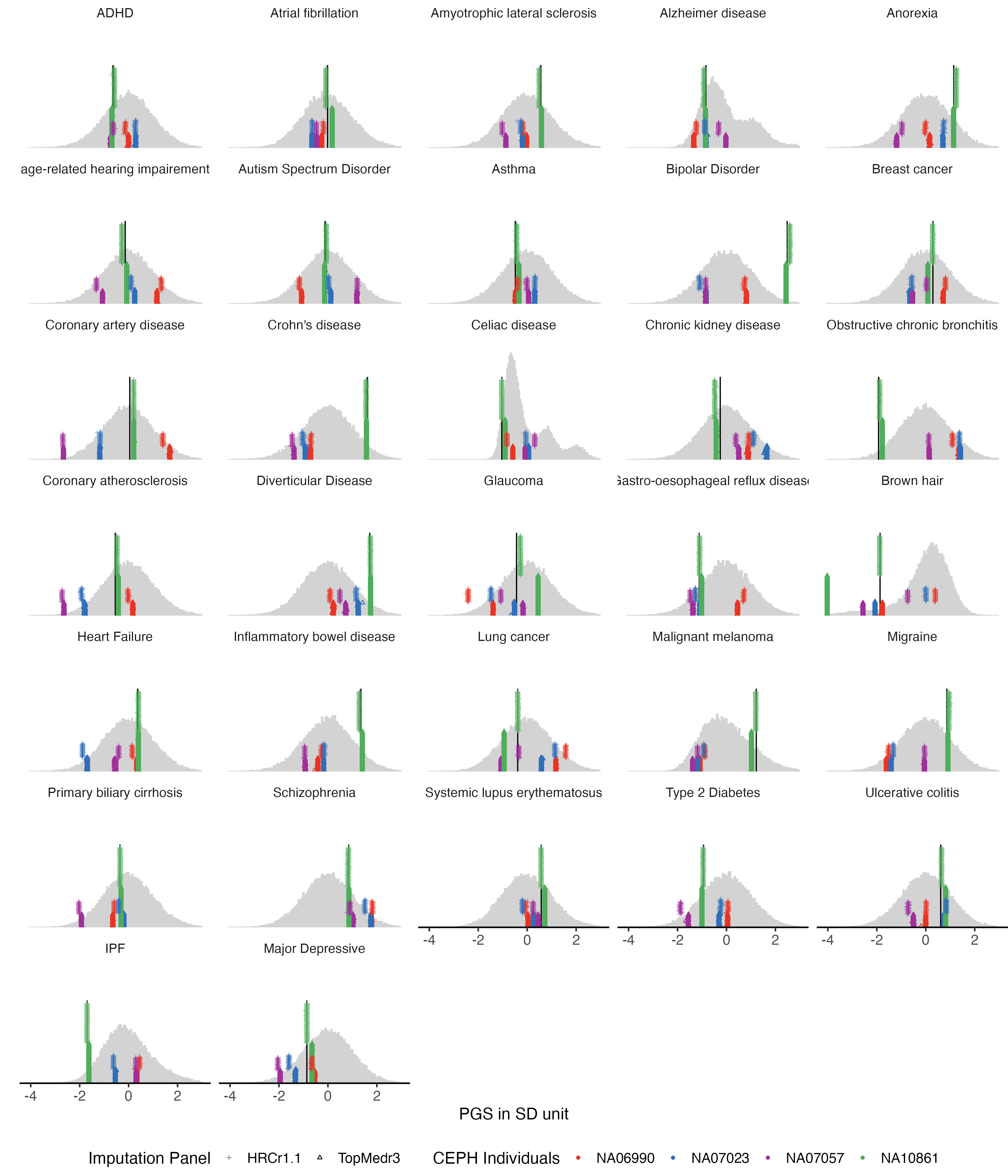
3.2 quantitative traits
example.g.hist = panel_plot(example.traits = traits_quanti, facet.col = 5,  legend.pos = "bottom",
                            melted.control.prs = melted.control.prs, data.vert = data.vert, melted.prs =melted.prs  )

example.g.hist

fig.heit = ceiling(length( traits_quanti) / 5 ) *2
#fig.heit

#ggsave(example.g.hist ,   filename = "Figures/Fig_PGS_benchmarking_example_HRC_vs_TOPmed_quanti.jpeg", width = 12, height = fig.heit)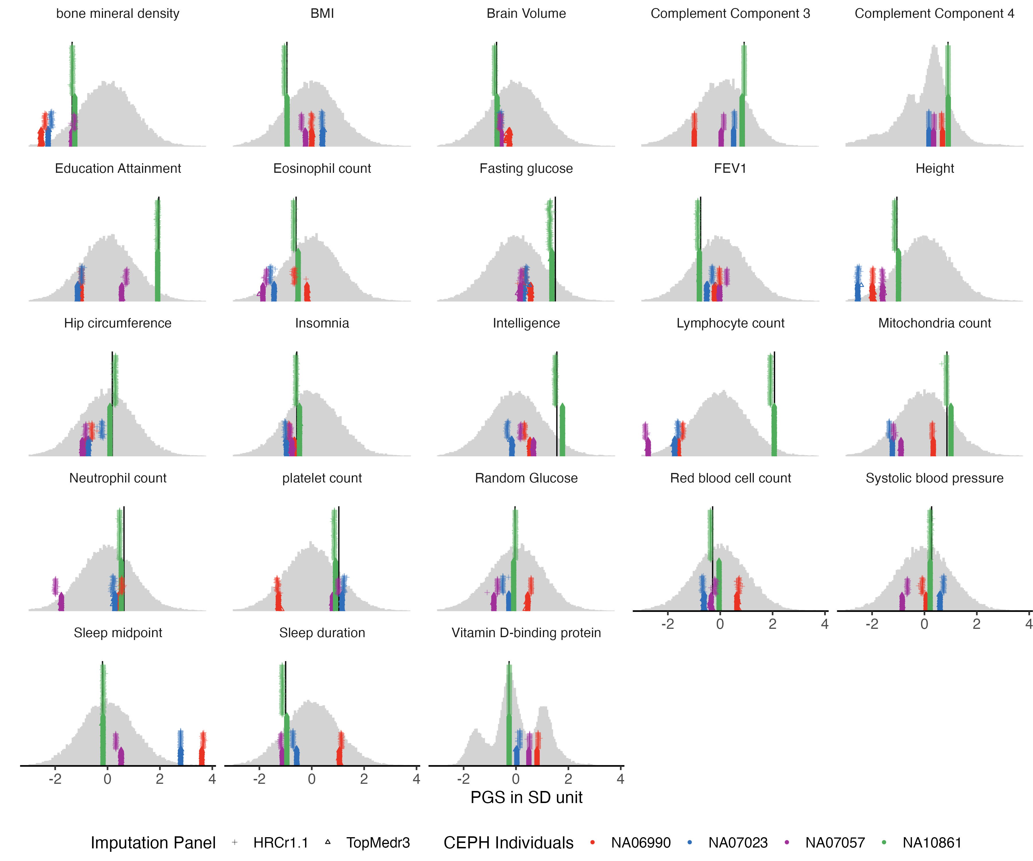
3.3 fatty acid
traits_fa = traits_pfa[grep("UKB_FA", traits_pfa)]
example.g.hist = panel_plot(example.traits = traits_fa, facet.col = 5,  legend.pos = "bottom" ,
                            melted.control.prs = melted.control.prs, data.vert = data.vert, melted.prs =melted.prs )

example.g.hist

fig.heit = ceiling(length( traits_fa) / 5 ) *2

#ggsave(example.g.hist ,  filename = "Figures/Fig_PGS_benchmarking_example_HRC_vs_TOPmed_FattyAcid.jpeg", width = 12, height = 8)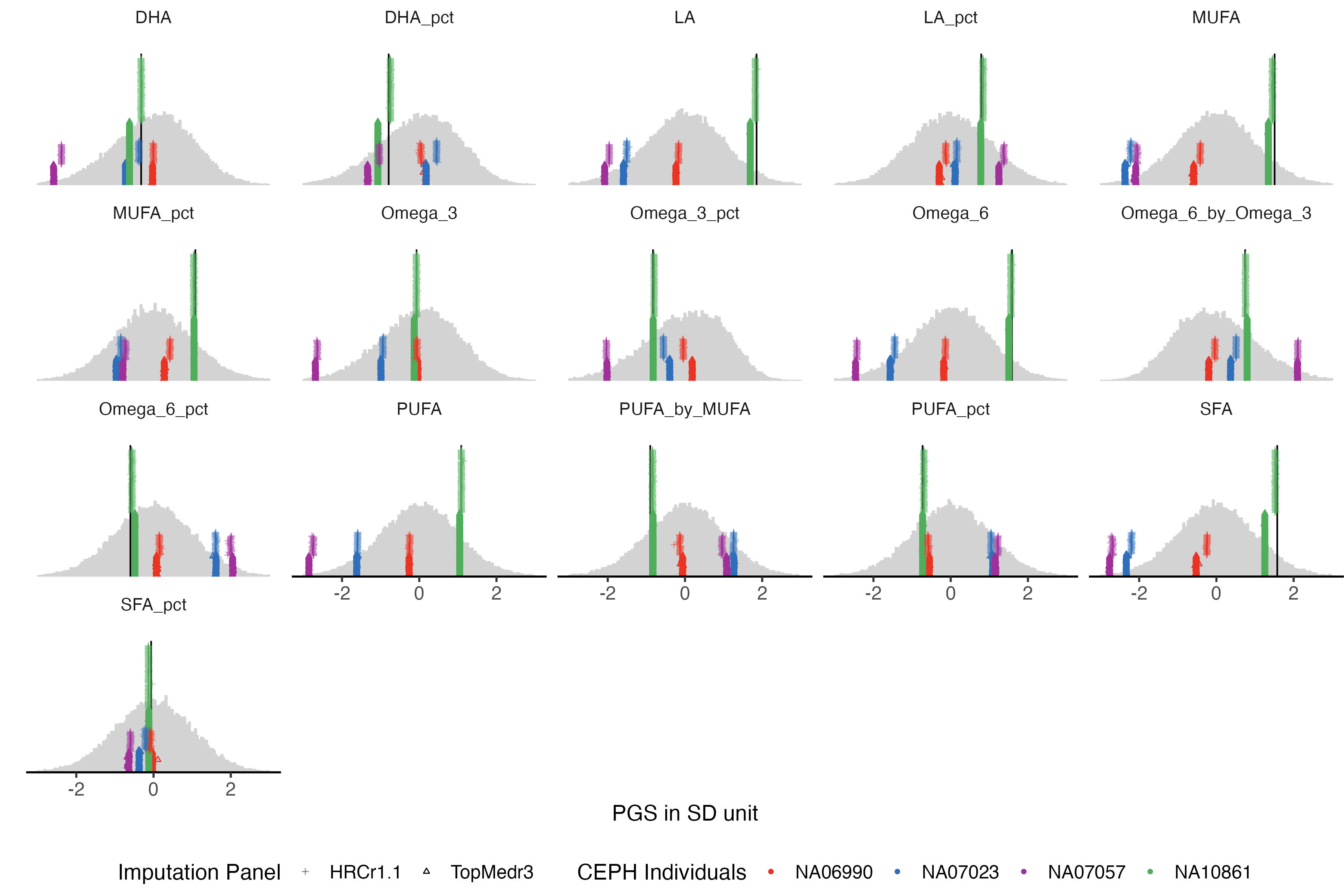
3.4 proteomics
traits_ppp = traits_pfa[grep("UKB_PPP", traits_pfa)]


example.g.hist = panel_plot(example.traits = traits_ppp, facet.col = 5,  legend.pos = "bottom" ,
                            melted.control.prs = melted.control.prs, data.vert = data.vert, melted.prs =melted.prs )

example.g.hist

fig.heit = ceiling(length( traits_ppp) / 5 ) *2

#ggsave(example.g.hist ,  filename = "Figures/Fig_PGS_benchmarking_example_HRC_vs_TOPmed_Proteomics.jpeg", width = 12, height = 5)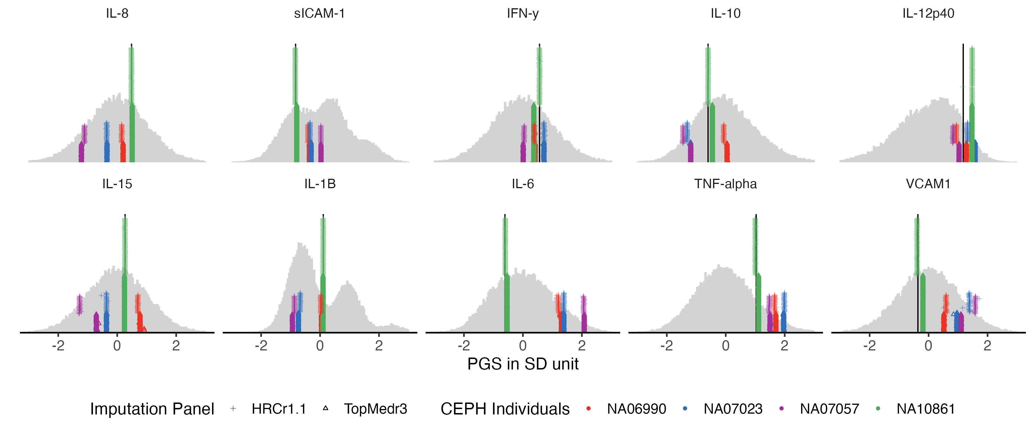
3.5 35 biomarkers
example.g.hist = panel_plot(example.traits = traits_35bm, facet.col = 5,  legend.pos = "bottom" ,
                            melted.control.prs = melted.control.prs, data.vert = data.vert, melted.prs =melted.prs )

example.g.hist

fig.heit = ceiling(length( traits_35bm) / 5 ) *2

#ggsave(example.g.hist ,  filename = "Figures/Fig_PGS_benchmarking_example_HRC_vs_TOPmed_35Biomarkers.jpeg", width = 12, height = fig.heit)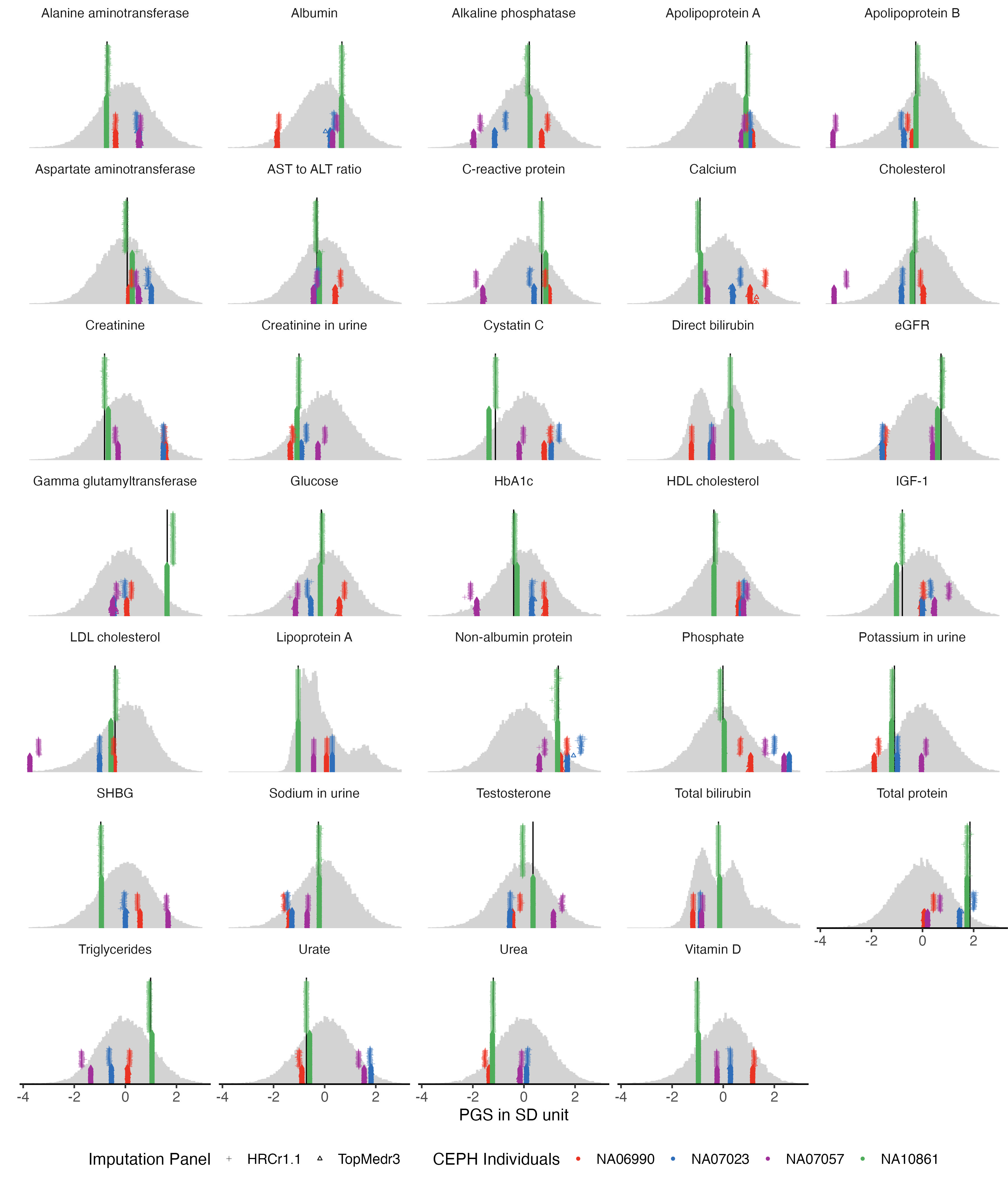
Also see: PGS:QS (quality score) · Missing SNPs and PGS-impute